
The bag colors that go with everything (and the ones to avoid)
Here’s what we’ve learned after watching hundreds of women carry the same bag for months: not all of those “go-to” colors they sell you actually work. Beige gets dirty too quickly. White turns jaune. Dark brown makes your light-colored outfits look dated.
After testing fifteen different colors of the Pont-des-Arts over the course of a full year, here’s what really works in everyday use.
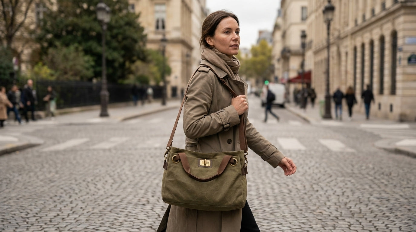
Shop the look: PONT-DES-ARTS - Regular - Olive

The three colors that deliver on their promises
Noir obvious but effective. The Noir Pont-des-Arts remains matte even after six months of heavy use. It adds structure to casual outfits, blends in with formal wear, and hides small stains better than any other color.
Blue-Gray: the surprise. This hybrid shade works as a neutral with warm tones (camel, beige, rust) and pairs naturally with cool tones (noir, white, navy). Visually more interesting than pure gray, and less prone to showing dirt than beige.
For a more comprehensive overview, see "How to Choose a Shoulder Strap for a Briefcase: The Complete Guide for 2026."
Camel but only if you wear a lot of warm colors. Camel fall and winter outfits, pairs perfectly with denim, but can clash with pure cool tones.
Why Traditional "Universal Colors" Fall Short
Beige seems like a logical choice on paper. In reality, it gets dirty quickly, yellows over time, and doesn’t add any structure to an outfit. Our customers who’ve chosen it often end up going back to bolder colors.
Brown presents a different problem: it makes your outfits look dated. When paired with noir, it creates a "mismatched" look. With navy, it lacks contrast. It works well, but only in a very specific context.
White? It looks great for three weeks, then it’s a disaster. Unless you’re particularly careful, steer clear.

How to choose based on your existing wardrobe
Open your closet. Count how many pieces you have in warm tones (camel, beige, rust, burgundy) versus cool tones (noir, white, gray, navy). If you clearly lean toward one side, choose a bag color from the same color family.
Does your wardrobe lean toward cool tones? The Noir Gray-Blue from Pont-des-Arts will blend in seamlessly. Does your wardrobe lean toward warm tones? The Camel even the Bordeaux will create an instant harmony.
If your wardrobe is a real mix-and-match, Blue-Gray is still your best bet. This color has a foot in both camps.
The mistake we see all the time
Choosing a color just because it looks nice in the product photo. Bag colors should be judged in context, not on their own. A color that looks stunning on its own might clash with 80% of your outfits.
Another pitfall: buying a bag in a color you fall in love with, thinking you’ll adapt your wardrobe to it later. It never works. The bag should fit your lifestyle, not the other way around.
We often hear from customers who fell in love with Corail Jaune, only to realize they wear them just once a month. These colors are gorgeous, but they require a wardrobe built around them.

Intermediate colors worth considering
Gray: the perfect neutral, but it can lack personality. It goes with everything, but doesn't add anything special to anything.
Bordeaux: looks elegant with neutral tones, but can be tricky with bright colors. An excellent choice if you wear a lot of noir, white, and gray.
Olive surprising but effective with denim, noir, and white. More unique than brown, less versatile than gray-blue.
The Pont-des-Arts comes in these fifteen colors for a reason: each one suits a different lifestyle. But if you’re really looking for the ultimate handbag color guide, focus on the first three.
Try before you buy
Before you order, try this exercise: make a list of the five outfits you wear most often. Picture each one with the bag color you’re considering. If it works with four out of five, you’re good to go. If it doesn’t work with two or more, think it over.
Also keep the seasons in mind. Camel fall but can look a bit heavy in summer. Light blue is perfect for sunny days, but it’s less obvious with heavy winter coats.
True versatility means a bag that works 300 days a year, not 365. Even the best colors have their limits.
Our final recommendation
If this is your first investment bag, go for Noir Blue-Gray. These Pont-des-Arts colors will give you maximum versatility as you refine your style.
Once you know your actual habits (not the ones you think you have), you can add a more personal touch with a second bag.
It would be a mistake to start with the "fun" color. Start with effectiveness, then add a touch of whimsy.